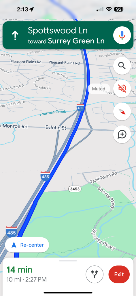
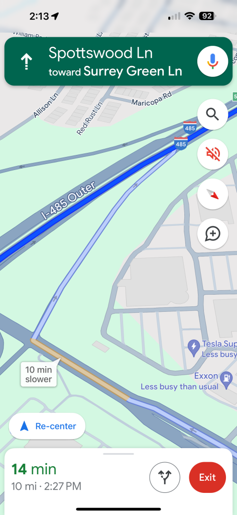
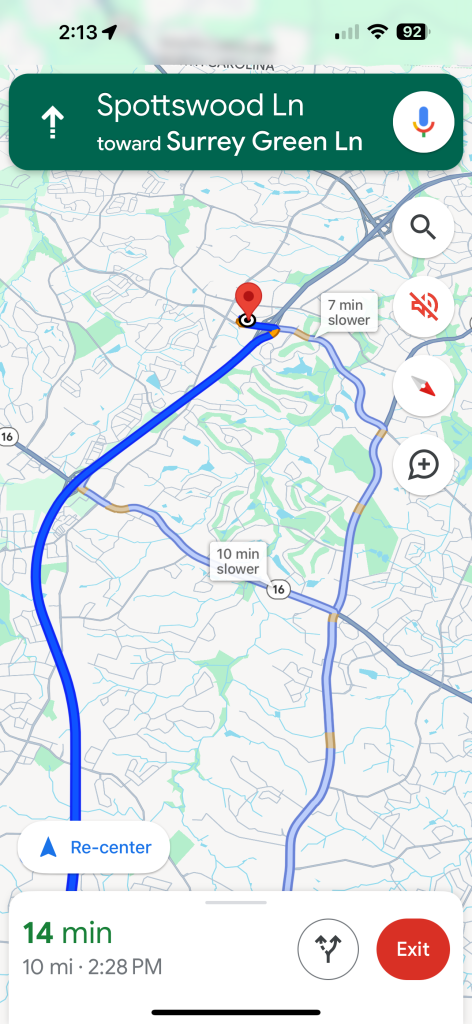
The digital tools we use daily become ingrained in our routines, and any significant change can disrupt the familiar comfort they offer. This is acutely evident in the recent update to Google Maps’ color scheme, which has prompted a wave of user dissatisfaction across social platforms. As Google Maps initiates the widespread rollout of its new color palette, the reaction from its user base ranges from mild irritation to outright disapproval. This blog post delves into the nuances of the recent changes, user responses, and the potential ramifications for Google’s staple navigation app.
A Shift in Visual Language:
Users turning to Google Maps for navigation have been met with an unexpected visual update. Although the changes to Google Maps’ color scheme are not radically transformative, they nonetheless have caught users off guard, resulting in a sense of unease. For many, these adjustments break away from the utility’s typically reliable visual framework.
Analyzing the New Aesthetic:

The most prominent changes include roads that have transitioned from white to gray, making them less conspicuous at various zoom levels. Water bodies have been recolored with a significantly paler blue, which although still distinguishable, may not be as pleasing to some users’ eyes. Forested areas are now represented with a darker shade of green, perhaps to offer a more realistic representation but also increasing the visual contrast on the map. Additionally, the route indicator strikes with a much brighter and arguably more jarring blue, which, for some, might distract from the rest of the map’s information.
Community Backlash:

Online communities, notably Reddit and Twitter, have transformed into hotbeds of debate regarding Google’s redesign. Comments from users express a range of emotions, chiefly frustration and dissatisfaction. One Reddit user lamented, “Not a fan. Just didn’t like them when I started seeing them a week or so ago. Not as easy to read for me. I’d switch back to the old colors if I could,” reflecting a sentiment of discomfort with the update’s impact on legibility. Another voiced, “Classic Google changes what was totally fine and makes it worse for no apparent reason,” indicating a broader distrust and discontent with alterations seen as unnecessary or regressive.
The Foremost Concern: Visibility and Usability:
The crux of the users’ discontent appears to center on the new color palette’s impact on map readability. With the colors deemed extremely washed out, details that were once prominent and accessible at a glance now require a closer examination. Such changes can be more than a mere annoyance; they can affect the ease and safety of using Google Maps while navigating unfamiliar routes.
Why the Change and Will Feedback Incite Reversion?

The rationale behind Google’s decision to alter the color palette of one of its most widely-used services remains unclear, raising questions and speculation from its user base. It is not uncommon for organizations to refine their products to stay current with design trends or improve user experience based on research-driven insights. However, these decisions can backfire when they do not align with user expectations or preferences.
The magnitude of the response from users may prompt a reconsideration of the updated palette. If history serves as a guide, user feedback has been known to influence tech companies to reevaluate their design changes, sometimes leading to a rollback or offering options to revert to traditional appearances.
Change, especially when applied to well-established and popular digital tools like Google Maps, must be executed with caution and foresight. As Google assesses its latest rollout amidst a tide of user dissatisfaction, it stands as a reminder that the balance between innovation and familiarity is delicate. Whether these changes will persist or whether user outcry will catalyze a return to the classic colors, the situation underscores the importance of user-centric design and the power of community feedback in shaping the digital products that navigate us through our daily lives.


